
Upgrade Your Brand
by Shane O’Neill, Vice President
Seasons change, people change…and so should your logo. Let’s be honest, there are a lot of bad logos out there. Some are so dated you’d think we’re still in the 70s, but why? With all the talk about marketing, your website, and social media, it seems that the last thing anyone ever talks about is one of the most important assets you have…your logo. As with everything in marketing, your success comes in the trenches. It’s the small little tweaks to your approach and strategy that provide opportunities over your competition. They all add up and your logo is the most visible and easiest to manage. Your logo is your business’s swag when out in public. Perception is everything and, when it comes to a logo, it can influence perceived status, business success, trust, and even brand recall.
The reason to pay attention to your logo’s evolution is that the world is also evolving. There are notable trends in colors, font choices, and even usage. The big brands know this and place a lot of energy in staying current, so why not take a cue from them? I once worked with John Deere to develop a logo for one of their new tractors coming to market. For three months and 8+ hours a day, we developed hundreds of logos and revisions to find the perfect essence of what the logo needed to convey. That’s a lot of time. However, once you think you have the perfect logo, you’d be surprised how much further it can be pushed. That’s the thought process of big brands. Generally speaking, you should look at your logo every 5 years or so and determine if it’s still current and functional. In most cases, small changes allow your logo to evolve without major overhauls. However, if it has stayed static for a decade or longer, it may be time for an overhaul.
Case Study
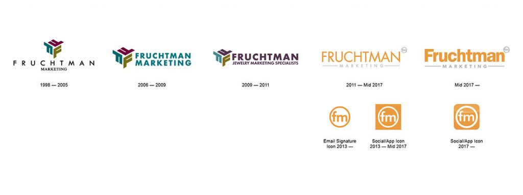
Let’s take a look at our own Fruchtman Marketing Logo and its evolution. We’ll start with the 1998 version through today as older versions are hard to come by. If you look at the timeline below, you’ll note the logo was fairly consistent up through 2011. Yes, there were small changes to stay current, including small color changes in the 2009 version, but for the most part, the logo maintained its overall look.


By 2011 the logo needed an overhaul. Not because we weren’t trying to keep it fresh, but rather due to a fundamental shift in technology and the world around us. By 2011, social media was all the rage, and there was a huge upgrade cycle happening with website technology in the move to responsive design. The floodgates were opening as the digital age fell upon us. Now, one had to consider their presence online and the additional needs and functions of a logo. Vibrant colors became the symbol for new and fresh as “super cool” online/tech companies began to pop up. Social icons and profile pics lent themselves more to “icon” like representations as wider logos didn’t work well in these more confined spaces. So, we re-envisioned our logo with a new typeface, vibrant color and incorporated the circle FM that would also serve as our icon for use in our email signatures and social/app presence. In 2017, we re-examined our font treatment as more businesses moved to logos that stood out well online. This was particularly the case for various forms of digital marketing where the real estate for a logo was much smaller than traditional forms of advertising. As businesses spent more of their marketing dollars online, the function of the logo required it to stand out in small spaces. Thus, we opted for a bolder font. We also felt the all-caps version of our logo began to look a little dated, so we moved to an upper case/lower case format that made our logo more current, fresh and exciting!
Now it’s your turn.
So, when was your logo last updated? Have you ever sat down and thought about some of the things discussed and how they apply to your business and your logo? Does your logo serve the purpose you need it to? Now would be a great time to make that assessment and put your best foot forward. Your logo is the face of your business. Is it time for a makeover?


