
Top Reasons to Visit Your Jewelry Store’s Website On Your Phone
by Charles Pobee-Mensah, Director of Digital Marketing
While working, most of us are much more likely to be using a laptop or desktop than a phone. So it’s only natural that when a jeweler reviews their website, they primarily look at it on a computer. But this doesn’t always help you produce the customer-facing experience that you’re trying to get right.
To help encourage you to view your jewelry store website on your phone, let’s talk about the top reasons to do so. These are in no particular order.
Most Visitors View It On Their Phones
If you’re reviewing your website for the experience that it gives your customers, mobile is the place to start. Over time, it’s become common knowledge that more people are viewing the web on their phones than on other devices. In addition to this, our own reporting experience with our clients shows that most of their website visitors are viewing on their phones. And by most, we mean usually at least 55%, but sometimes as high as 75% or even more. A good average is generally around 60%.
The experience you have viewing your jewelry store’s website on your phone is much more likely to match the experience that your customers are having.
Some Things Are Just Different On Mobile
It’s not only common for the mobile version of your website to display things differently. It might include or lack things that are the opposite on the desktop version. For example, sometimes sidebars might disappear on mobile sites rather than be repositioned. Other times elements in the header could be removed altogether on the mobile version.
These are common elements that you may assume all of your website visitors are seeing, but are not. And it’s a great reason to view your website on your phone.
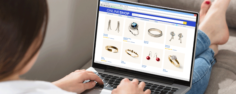
Ensure Your Gallery Is Engaging to Browse
Your website gallery may seem fine on desktop, but on mobile, it could be a much different experience. Often the number of columns and the layout of filters are different on mobile menus.
One of the common layout issues we see on mobile galleries is having a single-column gallery. Because jewelers often have hundreds of products to show potential buyers, showing them one at a time in a single column can lead to a low engagement. It’s just too much effort to look and find what you want. Instead, be sure to have a two-column gallery layout depending on your site.
Make Sure the Site Loads Fast
When you view your website on a desktop machine, it is much more likely to be connected to WiFi and have good processing power. Mobile devices are more likely to be connected to slower, sometimes spotty, cell data and have much lower computing power available.
Because of this, the trend in websites is to make them as lightweight as possible in order to still get the job done. When you view your store’s website on your phone, you can get a better idea of how fast your website is for mobile users. A website that loads fast on a desktop doesn’t mean it’s fast for everyone who views it.
Make Sure Text Is Readable
Mobile websites are working with a much smaller screen. For this reason, a lot of images must shrink in size. If those images have text in them, they could be unreadable on mobile despite being comfortable to read on desktop.
Little discrepancies like this are easy to overlook if you only ever view your website on a desktop device. But they become much more obvious when you view them on mobile.
If you’re looking for an agency that knows how to turn your website into a marketing machine, contact suits@fruchtman.com.